If you’ve spent any time on Pinterest, you might be familiar with infographics; people love pinning and repinning them. An infographic or information graphic takes complex information and date and organizes and represents it in an easy-to-read graphic or set of graphics. As Reif Larsen writes in their “This Chart is a Lonely Hunter: The Narrative Eros of the Infographic,” infographics are everywhere:
our media are now saturated with such infographics, both on-and off-line, as a host of publications such as The New YorkTimes, Good, TheGuardian, Wired, Time, The Economist, The Believer, and The Wall Street Journal all regularly depend on data visualizations to provide their readers with that on-the-spot, quasi-highbrow sociological analysis.
And many of the infographics created in these publications are pinned and repinned on Pinterest. Many people (myself included) are skeptical of the value and usefulness of these infographics. What exactly do they tell us about anything? Do they just look pretty on our computer or iPad or iPhone? I suspect that’s why they get pinned so much on Pinterest, which is often lauded for how “pretty” it is.
A well done infographic, one that allows us to make connections and understand complex data can be a wonderful thing. But what about the bad or fluffy ones? What purpose do they serve? And why do people want to pin them so often?
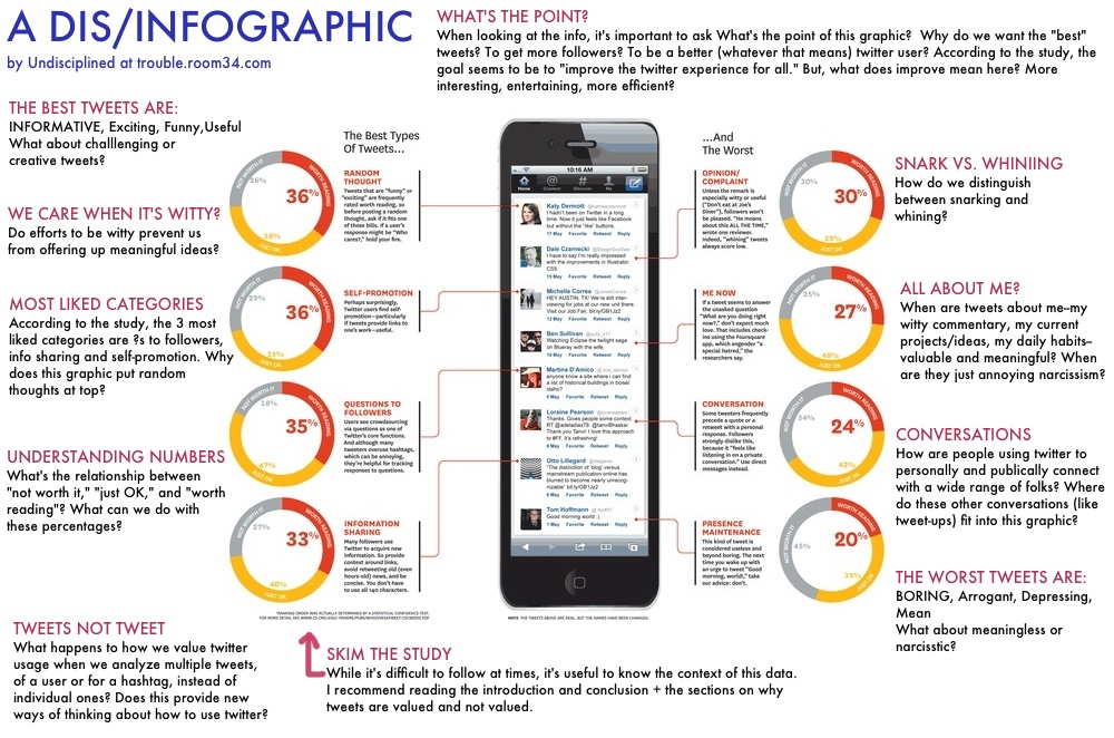
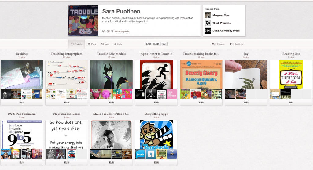
Lots of folks are discussing the limits and benefits of infographics. On my Pinterest board, Troubling Infographics, I’ve slowly been gathering articles about infographics and examples of (mostly bad) infographics. I’ve also added my own commentary, usually in the form of critical questions, to these infographics. After studying an infographic about twitter yesterday, I’ve decided that it was time to create my own infographic, or what I’m tentatively calling a dis/infographic, that troubles (challenges, questions, wonders about) the data on the graphic and how it is mis/represented. To create this dis/infographic, I’m putting my limited Pixelmator skills to the test.
Around 2 or so hours later…
Ugh. It’s a few hours since I began working on this dis/infographic, and I’ve finally finished. Let’s just say that I’m not good friends with Pixelmator right now. I’m happy that I experimented with making it though. I can’t decide if I want to try it again or not? Is it too much of a time suck or a useful exercise? If I could build up my skills some more, it might be a good way to trouble graphics, etc. Hmm…still not sure. For now, here’s my dis/infographic:
And, here’s the study that the original infographic (and my troubling of it) is based on: Who Gives a Tweet?


